Beer and Breweries EDA Project 1
Joshua Turk, Matthew David
2023-03-03
Libraries Used:
library(tidyverse)
library(ggthemes)
library(usmap)
library(caret)
library(class)
Imports:
beer <- read.csv("BeerEDA Data/Beers.csv", header = TRUE)
brew <- read.csv("BeerEDA Data/Breweries.csv", header = TRUE)

#Cleaning the space in state names
brew$State <- substr(brew$State, 2, nchar(brew$State))- This bar chart shows how many breweries are in each state. We can see that Colorado has the most breweries at 47 and West Virginia, South Dakota, North Dakota, and DC all are tied with only 1 brewery. Also included is a heatmap of the breweries across the states (Using usmaps library).
brew %>% count(State) %>%
  ggplot(aes(reorder(State, -n), n)) +
  geom_col(fill = "#bc9c54") +
  geom_text(aes(label = n), position = position_dodge(width = 0.9), hjust = -0.25) +
  coord_flip() + labs(title = "Breweries by State", y = element_blank(), x = element_blank()) +
  theme(legend.position = "none", axis.text = element_text(size = 13))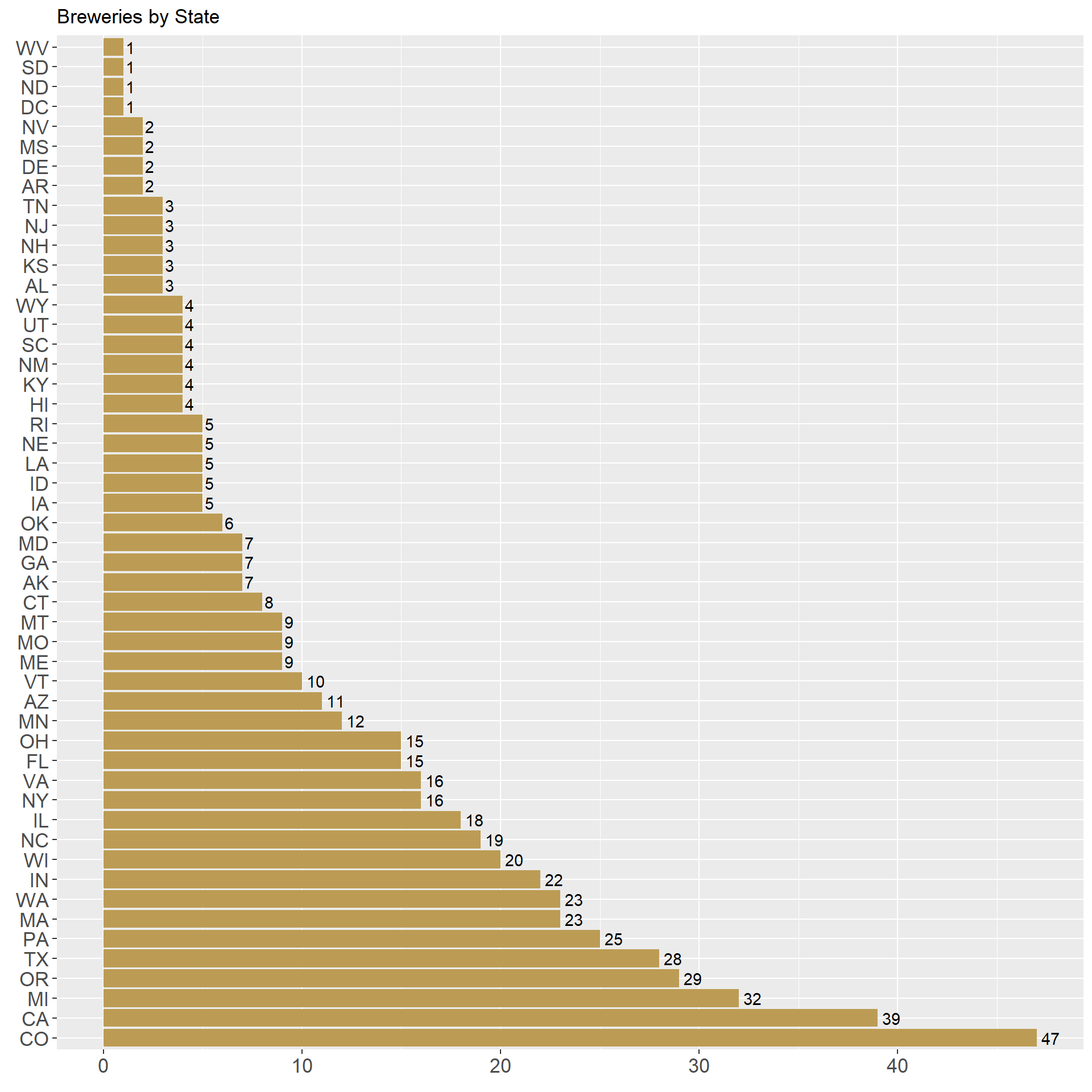
mapdata <- brew %>% count(State) %>% rename("state" = "State")
plot_usmap(data = mapdata, regions = "state", values = "n", labels = TRUE) +
  scale_fill_continuous(low = "#213740", high = "grey", name = "Brewery Count")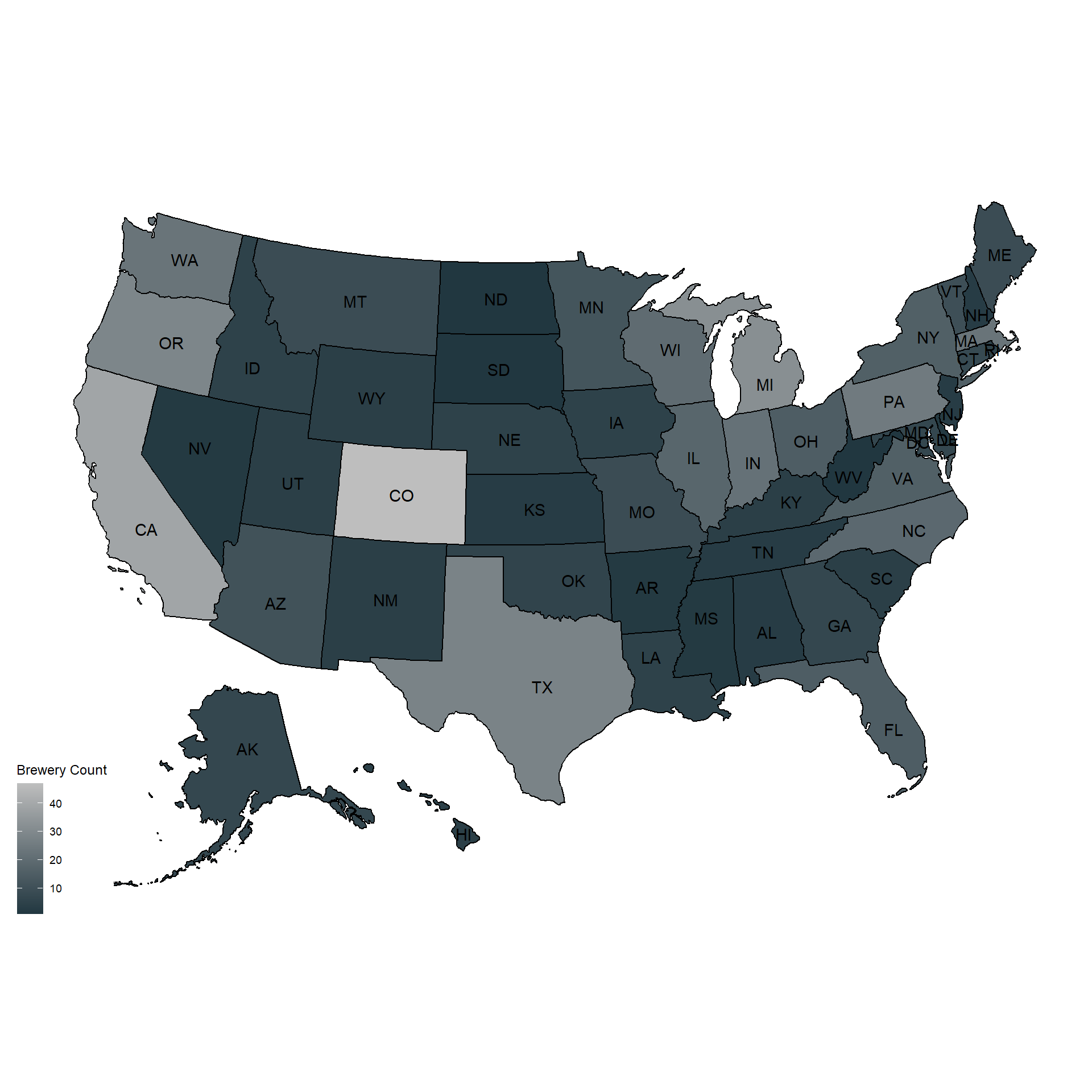
- Here the data is joined using a left join.
beerbrew <- beer %>% left_join(brew, by = c("Brewery_id"="Brew_ID"), suffix = c(".Beer", ".Brewery"))- We decided to impute the missing values in the ABV and IBU columns with the overall mean of the respective column in order to preserve the data.
beerbrew$IBU[is.na(beerbrew$IBU)] <- mean(beerbrew$IBU, na.rm = TRUE)
beerbrew$ABV[is.na(beerbrew$ABV)] <- mean(beerbrew$ABV, na.rm = TRUE)- These charts display the median IBU and ABV in each state.
beerbrew %>% filter(!is.na(IBU)) %>% group_by(State) %>%
  summarize(median = median(IBU)) %>%
  ggplot(aes(reorder(State, -median), median)) +
  geom_col(fill = "#bc9c54") + coord_flip() +
  labs(x = element_blank(), y = "Median IBU", title = "Median IBU By State") +
  theme(legend.position = "none", axis.text = element_text(size = 13))
beerbrew %>% filter(!is.na(ABV)) %>%
  group_by(State) %>% summarize(median = median(ABV) * 100) %>%
  ggplot(aes(reorder(State, -median), median)) +
  geom_col(fill = "#213740") + coord_flip() +
  labs(x = element_blank(), y = "Median ABV", title = "Median ABV By State") +
  theme(axis.text = element_text(size = 13))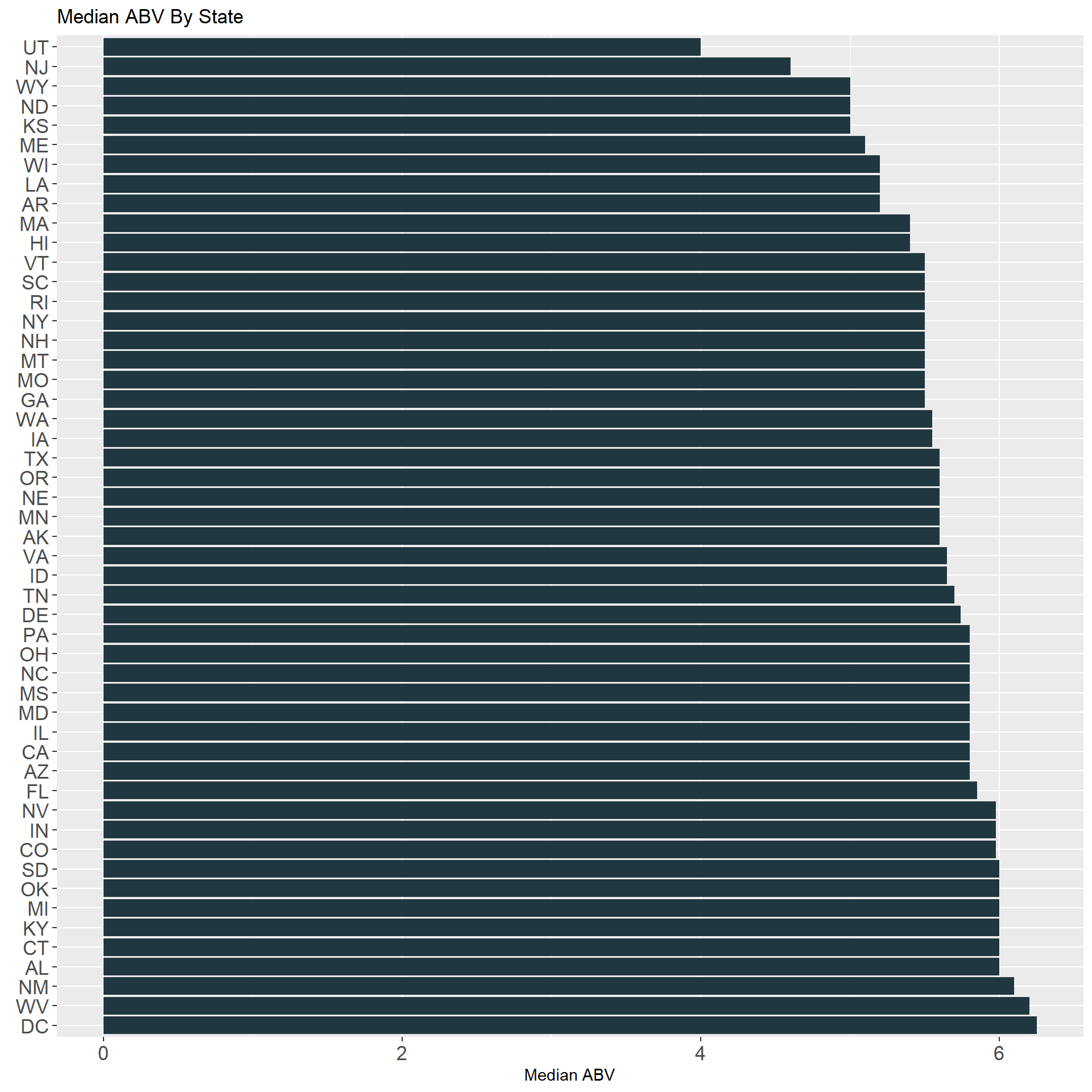
- Here we can see the beers with the highest ABV and IBU. The highest IBU is the Bitter Bitch Imperial IPA from Oregan. The highest ABV is the Lee Hill Series Vol. 5 from Colorado.
beerbrewIBU <- beerbrew %>%  arrange(-IBU)
beerbrewABV <- beerbrew %>%  arrange(-ABV)
head(beerbrewIBU, 1)
## Name.Beer Beer_ID ABV IBU Brewery_id
## 1 Bitter Bitch Imperial IPA 980 0.082 138 375
## Style Ounces Name.Brewery
## 1 American Double / Imperial IPA 12 Astoria Brewing Company
## City State
## 1 Astoria ORhead(beerbrewABV, 1)## Name.Beer Beer_ID ABV
## 1 Lee Hill Series Vol. 5 - Belgian Style Quadrupel Ale 2565 0.128
## IBU Brewery_id Style Ounces Name.Brewery
## 1 42.71317 52 Quadrupel (Quad) 19.2 Upslope Brewing Company
## City State
## 1 Boulder CO- Here we can see the distribution of ABV as well as the summary statistics.
beerbrew%>%ggplot(aes(x=ABV)) +
  geom_histogram(color="#213740",fill= "#bc9c54")+
  ggtitle("Distribution of ABV")+theme(legend.position = "none")
## `stat_bin()` using `bins = 30`. Pick better value with `binwidth`.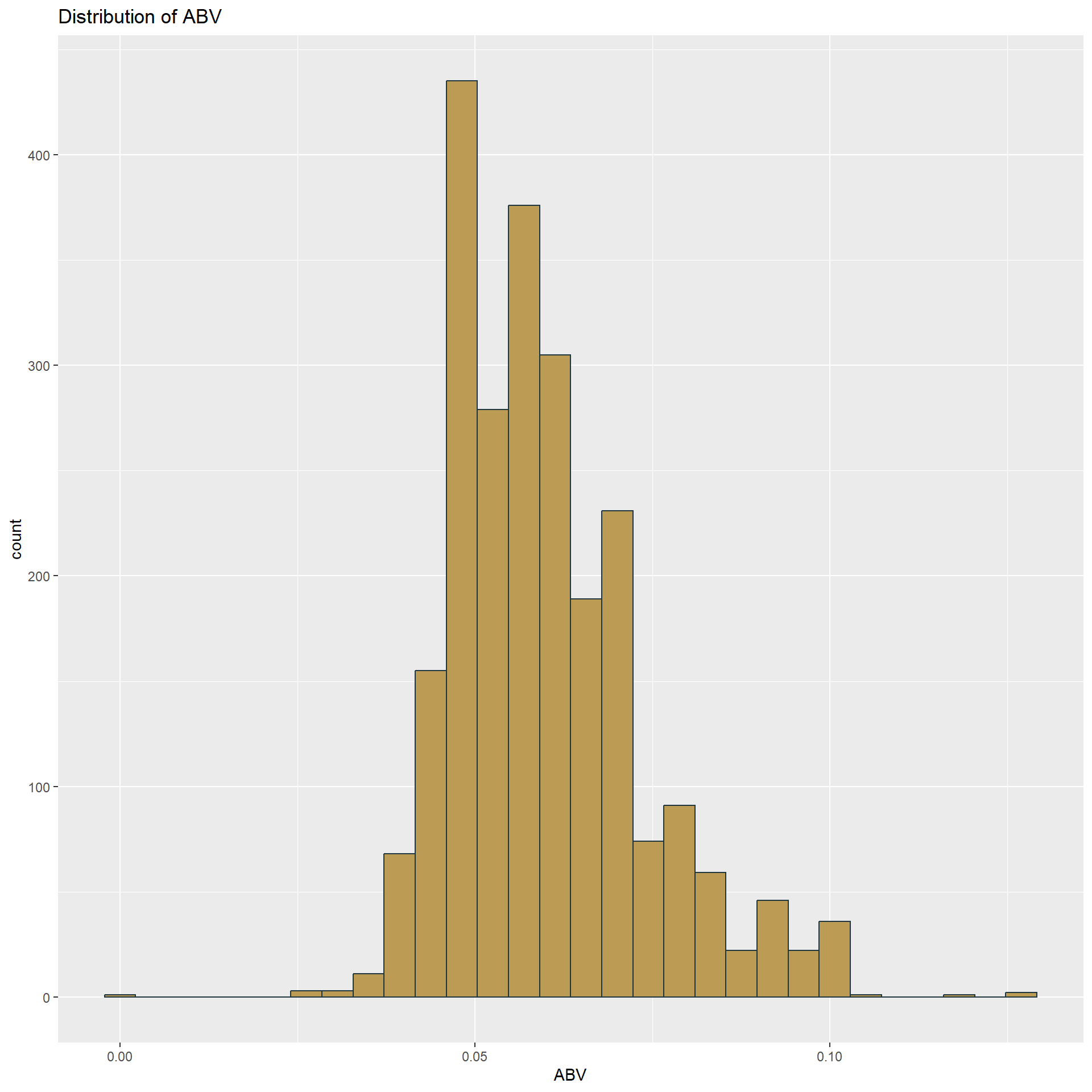
summary(beerbrew$ABV)## Min. 1st Qu. Median Mean 3rd Qu. Max.
## 0.00100 0.05000 0.05700 0.05977 0.06700 0.12800- In order to look at the relationship between ABV and IBU we’ve created a scatterplot. There appears to be a positive correlation between the two variables, however this relationship isn’t the strongest.
beerbrew %>% ggplot(aes(ABV, IBU, alpha = 0.5)) +
  geom_point(color = "#213740") +
  geom_smooth(method = lm, se = FALSE, color = "#bc9c54") +
  theme(legend.position = "none")
## `geom_smooth()` using formula = 'y ~ x'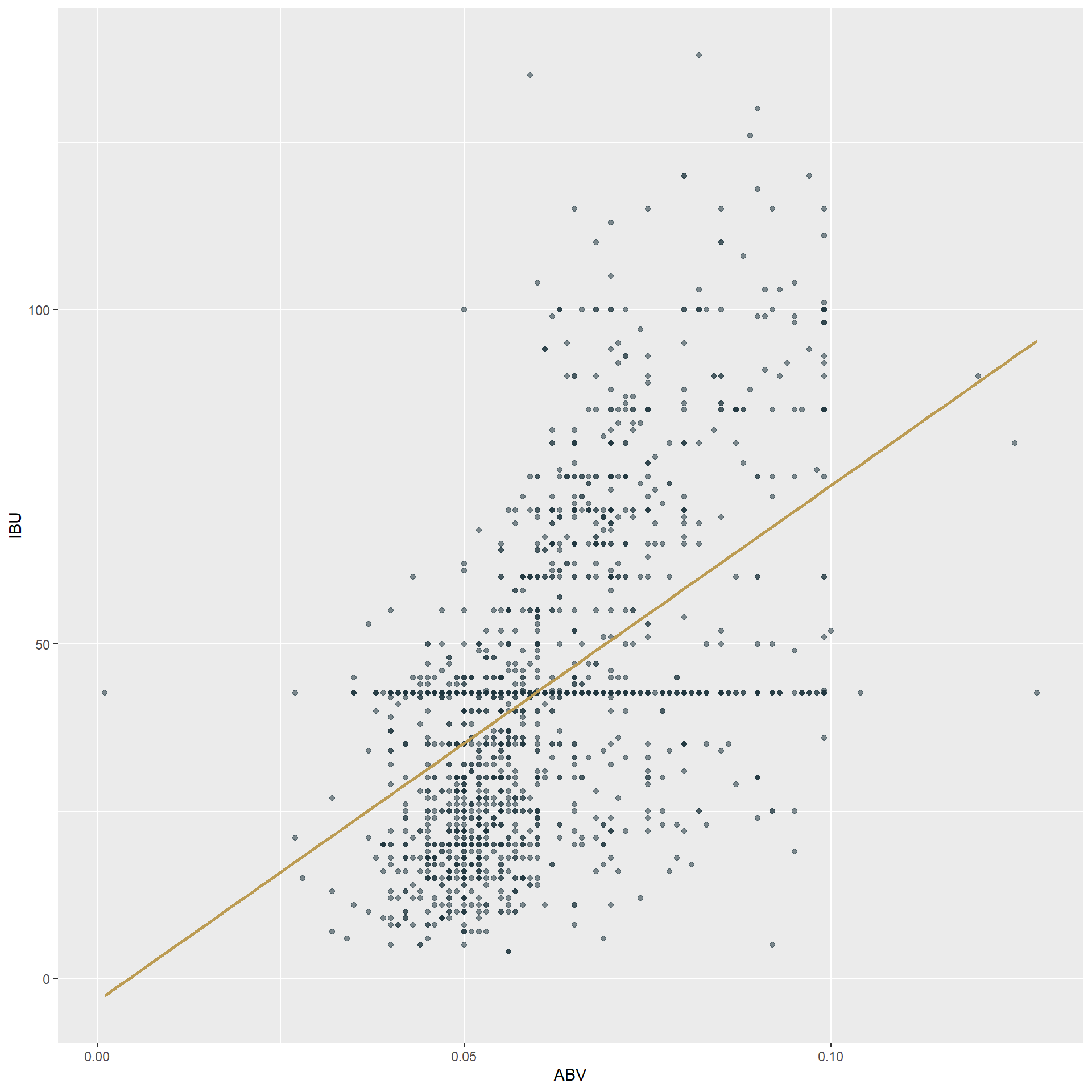
- To investigate the difference with respect to ABV and IBU between IPAs and other Ales, we have created a kNN model. This model yields an average accuracy of about 81.6%, showing that IPAs and Ales can be fairly well defined by just their ABV and IBU.
#filtering and categorizing as IPAs and Ales only
beerbrewAles <- beerbrew %>% filter(grepl("IPA", Style) | grepl("Ale", Style))
beerbrewAles$Style[grepl("IPA", beerbrewAles$Style)] <- "IPA"
beerbrewAles$Style[grepl("Ale", beerbrewAles$Style)] <- "Ale"
beerbrewAles$Style <- as.factor(beerbrewAles$Style)

#create train and test
index <- sample(seq(1,1534,1), 1534 * .7)
beerTrain <- beerbrewAles[index,]
beerTest <- beerbrewAles[-index,]

#classification
classification <- knn(train = beerTrain[,c("IBU", "ABV")], test = beerTest[,c("IBU", "ABV")], beerTrain$Style, prob = TRUE, k = 5)
confusionMatrix(table(classification, beerTest$Style))
## Confusion Matrix and Statistics
##
##
## classification Ale IPA
## Ale 247 35
## IPA 45 134
##
## Accuracy : 0.8265
## 95% CI : (0.7887, 0.8599)
## No Information Rate : 0.6334
## P-Value [Acc > NIR] : <2e-16
##
## Kappa : 0.6309
##
## Mcnemar's Test P-Value : 0.3143
##
## Sensitivity : 0.8459
## Specificity : 0.7929
## Pos Pred Value : 0.8759
## Neg Pred Value : 0.7486
## Prevalence : 0.6334
## Detection Rate : 0.5358
## Detection Prevalence : 0.6117
## Balanced Accuracy : 0.8194
##
## 'Positive' Class : Ale
## #k optimization, k = 5
set.seed(1)
iterations = 10
numks = 20
splitPerc = .7
masterAcc = matrix(nrow = iterations, ncol = numks)
for(j in 1:iterations)
{
trainIndices = sample(1:dim(beerbrewAles)[1],round(splitPerc * dim(beerbrewAles)[1]))
train = beerbrewAles[trainIndices,]
test = beerbrewAles[-trainIndices,]
for(i in 1:numks)
{
classifications = knn(train[,c("IBU", "ABV")], test[,c("IBU", "ABV")], train$Style, prob = TRUE, k = i)
table(classifications,test$Style)
CM = confusionMatrix(table(classifications,test$Style))
masterAcc[j,i] = CM$overall[1]
}
}
MeanAcc = colMeans(masterAcc)
plot(seq(1,numks,1),MeanAcc, type = "l")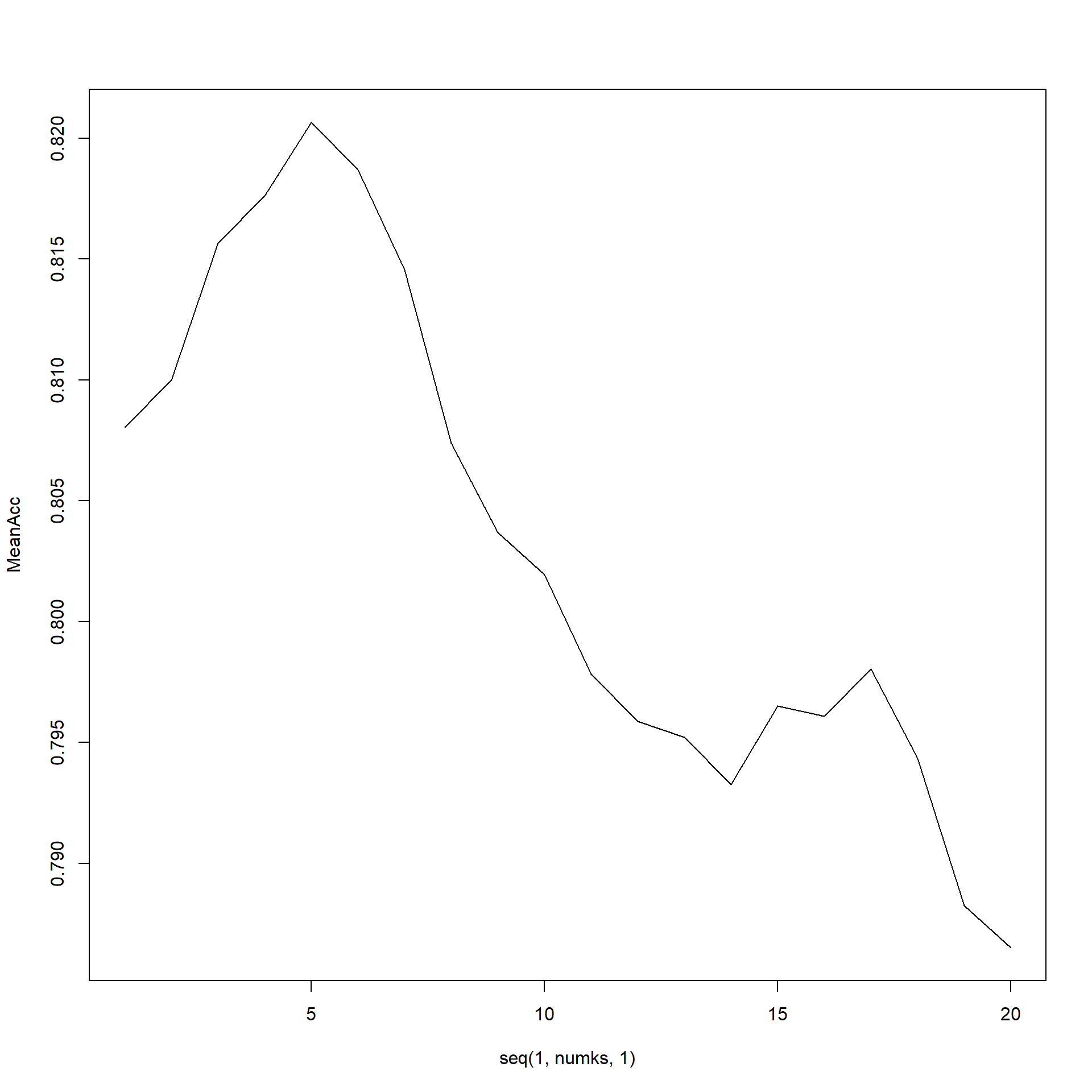
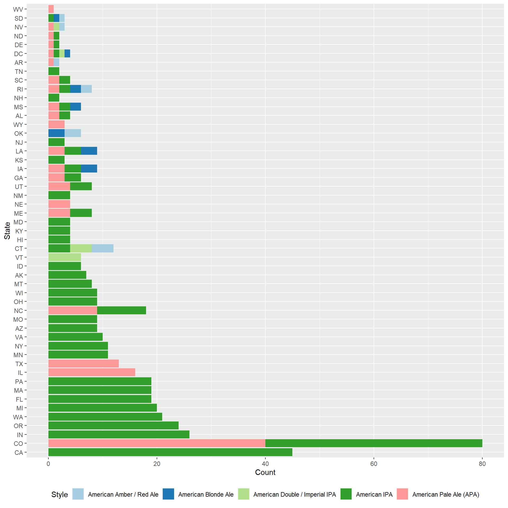
which.max(MeanAcc)## [1] 5max(MeanAcc)## [1] 0.8206522- For this point we wanted to look at the most popular styles in the U.S. and see which states those were coming from. The most popular style in the US is the American IPA and California is the top producer of this style.
#Top 5 styles
style_counts <- data.frame(table(beerbrew$Style))
head(style_counts %>% arrange(-Freq),5)
## Var1 Freq
## 1 American IPA 424
## 2 American Pale Ale (APA) 245
## 3 American Amber / Red Ale 133
## 4 American Blonde Ale 108
## 5 American Double / Imperial IPA 105#Top styles in each state
beerbrew %>%
filter(Style == "American IPA" | Style == "American Pale Ale (APA)" | Style == "American Amber / Red Ale" | Style == "American Blonde Ale" | Style == "American Double / Imperial IPA") %>%
count(State, Style) %>%
arrange(-n, State) %>%
group_by(State) %>%
top_n(1,n) %>%
ggplot(aes(reorder(State, -n), n, fill = Style)) +
geom_col() +
xlab("State")+
ylab("Count") +
scale_fill_brewer(palette = "Paired") +
coord_flip()+
theme(legend.position = "bottom")